
Swell
A self-initiated sustainable surf brand created to develop my abilities in Figma, while experiencing the full product design journey from conception to final outcome.
I up-skilled in Figma to hit the ground running when I joined the NHS App team, completing the Udemy course: Figma UI UX Design Essentials. This 12 hour deep dive explores everything from mood boarding to auto layout, maintaining component libraries to prototyping.
Overall, this project accumulated to over 80 hours of learning, and has allowed me to explore my interests in branding, illustration and visual design together harmoniously.
BRANDING
ILLUSTRATION
SERVICE DESIGN
VISUAL DESIGN
Project length:
4 weeks
Role:
Service, Illustration, Art Direction, UX/UI
Tools used:
Figma, Fresco, Illustrator
With thanks to:
Katy Oldfield

Our goals:
-
Create a flow of 4 screens: Homepage, Product listing page, Product details page & Checkout.
-
Develop a strong and authentic brand.
-
Iterate my concepts from mood board to high fidelity designs, holding users at the centre of that experience.
The process:
This began with a mood board for my surf brand, considering target audience and the type of designs they may be receptive to. I looked into successful, trusted outdoor brands that have been around for a long time, which inspired me to design something with simplicity in mind, something traditional and of high quality, but also new, bright and joyful.
As my familiarity with Figma increased, my designs quickly improved in quality; I learnt how to create components and variants, maintain a component library, and add interactions & micro-animations to my prototype.


A change of direction
As I iterated my designs, I sought out feedback from more experienced designers. Although this feedback was positive overall, I concluded that the designs were lacking a level of personality - as this project had no limitations, I felt obliged to create something more exciting and trend-led.
This lead to re-working the entire project. I began with my mood board, building in trend-led, warmer toned imagery, culminating in a brand that felt more youthful, modern and engaging (see below). I applied what I had learnt throughout the course to create unique interactions on this re-worked version, sparking moments of joy throughout the experience.


User experience
To match the bright, youthful imagery of my re-worked mood board, I decided to explore a different way of laying out the same user flow, considering how I could make the user’s experience more joyful as well as personal.
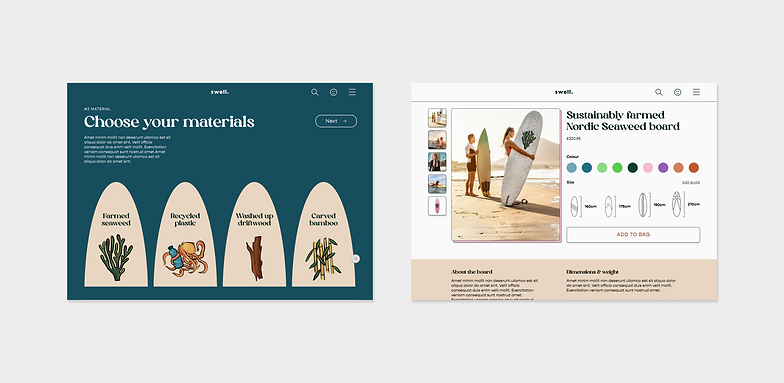
This led to the development of a ‘quiz’, where the user is led through a series of questions about their needs, where at the end a product based on these needs is suggested to them. To add a touch of playfulness to the design, I made each ‘answer’ in the quiz an interactive surfboard that changes on hover.
Imagery & Illustration
To bring the brand to life and integrate my skills in graphic design I created hand-drawn illustrations, with the aim of tying in the joyful and exciting feeling of the brand throughout the user experience. The illustrations were made in Adobe Fresco, using the warm colours from my mood board to create a safe or inviting feeling, while adding in bold, punchy colours to evoke a sense of youthful playfulness - just as any good surf brand should.
Additionally, I made sure to choose my brand’s imagery very carefully, matching it to the tone of my illustration style as well as the tone of my brand. Therefore, I selected photos with warm, saturated hues that felt uplifting and inclusive.


Prototyping & layout
Parents receive a letter home containing their unique code to access all of Beyond’s resources, from viewing their child’s progression through the programme, to advice from other parents and the wider community.
This gives parents the autonomy to start conversations with their children before or after certain lessons, should they wish to.
The response
While learning a new software, this project gave me the opportunity to be really creative. I was able to create a full product design journey for a theoretical brand of my choosing, including the concept, elements of service design, UX, UI, branding, typography, colour, illustration, prototyping and micro animations.
I presented these designs during the IBM iX showcase to over 50 people where I received positive feedback. I'm really proud to have produced something of this extent and quality independently.


Reflections
I am delighted with what I have been able to achieve with this project; I have learnt how to use Figma as well as the best way to approach a project with such a powerful design tool. However, when I have the time I would like to continue to refine these design further as I gain knowledge and experience.
One change, as shown above, would be to better utilise my illustrations within cards and banners, to create something that helps to sell the brand rather than just perform a basic function. The photo I used in this banner (see right) did not compliment the orange colour next to it, and the equal split of image and text down made the banner feel disjointed. Improve this, I implemented subtle suggestions of brand and purpose into the banner to make the intention behind it feel clear and self explanatory to the user.
In an ideal world I would love to go back and complete a mobile flow for the re-worked designs, the exercise of doing so would be an excellent design exercise and help to really draw my vision for the project together.