
The NHS App
The NHS App is the leading healthcare app in the UK, with over 30 million sign-ups. With over 20 services, it is vital that user’s are able to access the service they require easily. The NHS therefore requires a strong and well-documented design system so that each screen can be designed & built correctly and at pace.
To make this happen, I was asked to be part of the team evolving the current Design System, with the aim of producing a more detailed, usable version to enhance the current app experience. The end goal is to use this elevated design system to create a more cohesive and logical experience for our end users. Additionally, we have scope to improve the aesthetic of the App, bringing it more in-line with user expectations for a modern app in the healthcare space.
Project length: February - July 2023
Role: Visual Designer
With thanks to Katy Oldfield, George Rowe, Max Rickards & Lauren Ball
Our goals:
-
Build the Design System using atomic design, up-skilling along the way to form the foundations of the styles, components and pattern correctly.
-
Produce visually appealing, intuitive UI with accessibility embedded into its core.
-
Consider how we could enhance the overall experience for both user bases - the NHS App's end-users as well as its designers.


Due to silos within the teams and the design system being handed over from another company, there is misalignment across the Design System. This has lead to confusion and inconsistencies in the designs as well as duplicates/ custom components. This is reflected in the live app, where users have difficulty building mental patterns, making the app harder to use and navigate.
The ask of our team is to re-work this Design System specifically for mobile, building accessibility and best practises into the core of our designs & documentation.
"It gives off the same look as a filing cabinet"
"There's a brick wall between you and help"
"Wow that's a lot of reading to do"
User Research conducted by Lauren Ball, May 2023

UR & UT
Designing a public-facing service like the NHS App brings with it an array of user needs, making User Research and User Testing a vital starting point for our team.
This involved discovering pain points both for the app's end user bases as well as its designers using the Design System (DS).
Benchmarking
As a small team designing for a huge organisation, documenting our DS in a way that was inarguably clear was instrumental. We carried out benchmarking of well-known Design Systems including Atlassian and National Grid, understanding best practises to implement in our own, evolved DS.
New look & feel
Alongside the evolution of the NHS DS was the 'look & feel' piece of work. The team was limited by technical constraints due to the app being web based, meaning we had to work within these constraints to create a more intuitive, usable app that still felt like an NHS experience.


Component Design
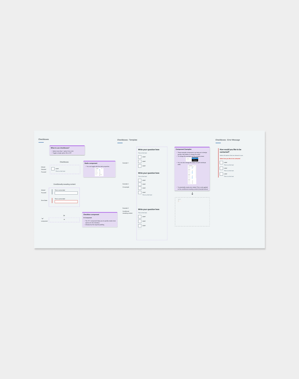
One of my key contributions was laying the foundations of the DS, starting with colour, typography and spacing tokens. Here we built accessibility in the core, colour contrast testing every single colour in the system.
I created the first component in the Design System: buttons, utilising Figma's auto layout and formulating a documentation template for the rest of the design system to be based on. This documentation is paramount in demonstrating the usage of specific components, which is vital when communicating to such a large team.
Documentation
To accelerate the work of both teams and minimise inaccuracies, I acted as the middle ground between design and development. I did this by collaborating with both teams to understand what they need from a design system to produce their best work, such as a component breakdown, all of the states, and guidance on how to use the component in comparison with any previous versions. This meant that both teams could interact with the design system and use it to work at pace.
Look & feel designs
To ensure consistency across the NHS App and web experiences, we have not changed any of the brands colour or typography, but have re-used them differently to create a sleeker, premium experience.
For example, we rearranged the hierarchy of the screen by removing the NHS brand blue from the header to the bottom navigation, giving it more prominence. Additionally, we increased the padding between components to allow the design to breathe, easing usability particularly for those with accessibility needs.

The Response
This project is very early days - with codebase conversations continuing to unfold and the app already being live, the NHS App project is expected to continue for at least another year.
By gradually implementing our enhancements, we will produce a future-proof, open source design system paired with high quality app experience that is inclusive to all.

Reflections
Although we are only at the beginning, this project has been an excellent learning opportunity for me; I have learnt the impact of my design decisions on development and best practices when it comes to designing on such a large scale, for a 'demographic-less' app like the NHS.
Working on this has given me insight into the kind of work I want to do in my career - I have enjoyed working on something that really helps people, one that impacts the lives of thousands of users for the better.
Sadly, I have come to the end of my internship at IBM iX, meaning my time on the NHS App project is over. I am gutted to not be able to see this piece of work through, but I hope I will be able to return to completing this type of work upon finishing university.